
Nintendo E3

The Plan

After confirming with the analytics team and taking a look at our user data, we found that the majority of users were visiting the E3 site on desktop, at resolutions over 1200 pixels wide.
We decided that we would highlight exclusive new character art on game detail pages, with large-scale screenshots to take full advantage of the larger displays used by our audience.
On mobile, the character art would be removed to maximize the amount of space reserved for viewing screenshots.
- Stakeholders were pleased by the treatment of the character art on game detail pages.
- Even though we did not know exactly what assets we would receive at launch, the treatment of the character art on game detail pages worked for all games.
- Due to the confidential nature of the E3 event, game assets were not available until after the site was already built. As a result, we were not able to accurately predict the maximum number of screenshots per game detail page. This resulted in the thumbnail carousel sometimes being up to four rows tall, which pushed everything below the gallery header well past the fold on the most common audience resolutions.
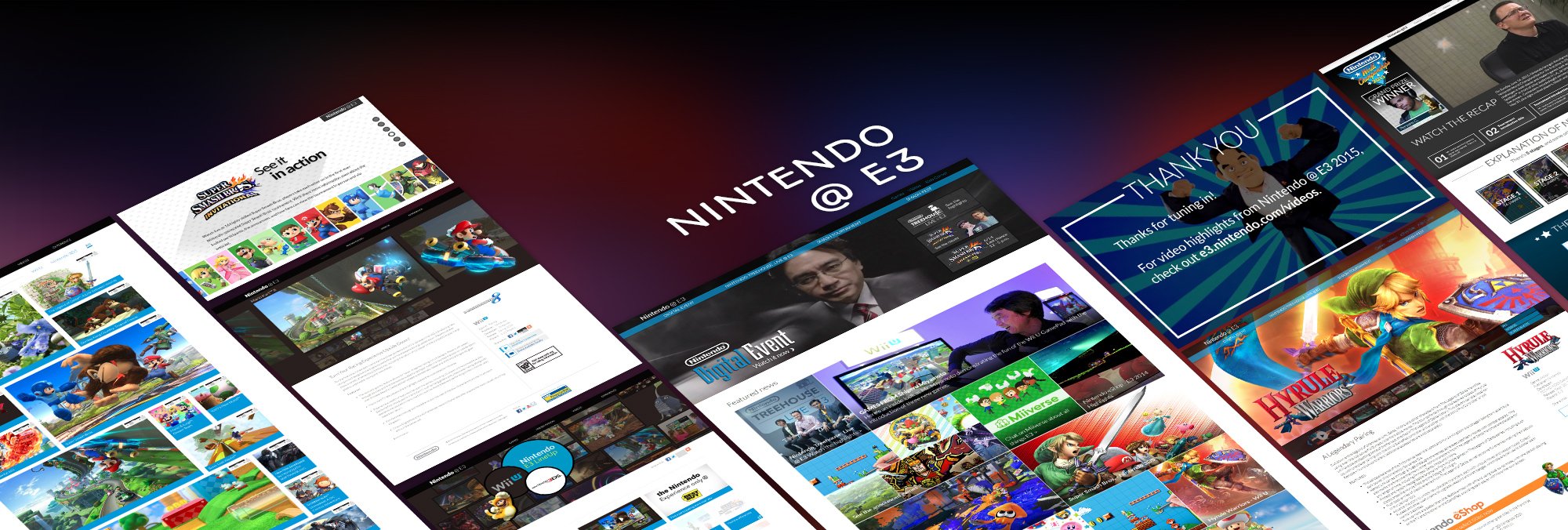


The Plan

1. Utilize multiple sizes of modules and masonry-style layouts to make the site flexible and accommodate the unknown number of games that were to be announced, and to account for the unknown dimensions of game assets to be featured in the site.
2. Since there are no hi-rez images available to use as focal points for section headers, leverage clips from E3 trailers and announcement videos as assets for the site.
- Layout was flexible enough to accommodate the final assets and support changing priorities.
- Stakeholders appreciated the video clips brought onto the pages and felt that it added excitement.
- It was hard to tell at a glance which games were for which specific platforms.
- On the homepage it was difficult to parse out which of the masonry boxes led to a game detail page, and which ones led to event-specific landing pages.
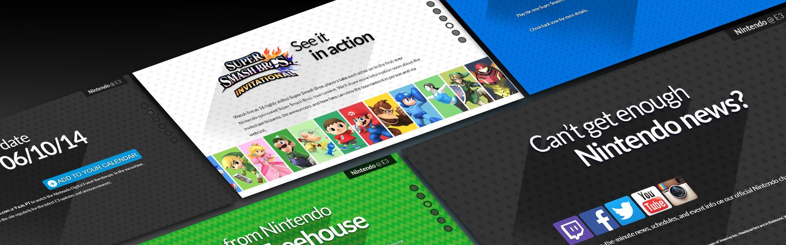


The Plan

1. Since there was video footage, trailers and other media assets from the previous year and there was going to be a strong emphasis on streaming content, we would leverage video as a large visual component of the site.
2. To mask the low quality of some of our assets, we would use a “screen” and “glass” theme / visual treatment to tie the teaser site and the live event site together.
- We had a lack of assets that could be used for the teaser phase of the site.
- Without knowing what the events, games or announcements were going to be, it was difficult to establish a theme that could carry between the teaser and live event phases.
- We knew streaming would be a key component of the site, but weren't yet sure how or where the stream would be hosted.
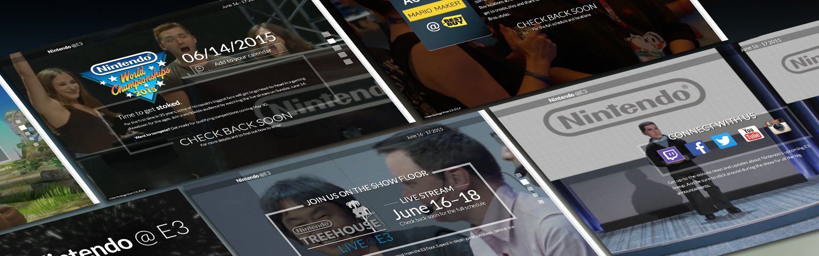
WIREFRAMES


Templates and Specs
I created multiple wireframes which became templates that were used to produce the pages for the E3 2015 teaser and event site.
To accompany the wireframes, I wrote specification documents which outlined how the templates are used. They also covered the expected behaviors and scenarios based on the design.
High Fidelity Designs
For this project, I created high fidelity design comps to explore the visual design elements of the site. Some examples of these designs are shown below.


